-
- Same-sex couples tie the knot in Iowa
- Connecticut passes update of marriage law
- Same-sex marriage foe faces ethics charge
- Library for GLBT books reopens in Fort Lauderdale
- Presbyterians reject gay clergy, but vote closer
- Colorado man convicted of murdering transgender woman
- National News Briefs
- World News Briefs
feature
A Splash of Color!
Using color to stimulate your mind, body and spirit
Published Thursday, 30-Apr-2009 in issue 1114
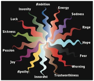
Color is complicated: Red, for instance, isn’t red, but a mixture of brown and green; while purple is a combination of red and blue.
But adding color to your life is simple. We can learn how color affects us and deliberately create results we want with it.
Think about it. You might not realize it, but there’s rarely a moment in your life when you’re not having a relationship with color. You see color from the minute you wake up, throughout your entire day and even in your dreams.
Color is affecting us subconsciously all the time. It affects how we feel in an environment and in our clothes. It can shift our mood and create an impression. Have you ever entered a room and been instantly depressed? Have you ever met someone and formed an instant idea about them because they wore a vibrantly colored shirt or had red hair?
Our brains need to make sense of what they experience, and one of the key ways they do this is to unconsciously react to color. Color helps us make judgments about what we see and sense. It can warn us away or draw us near; it can uplift us or depress us. It can even affect our health. Color can reduce stress, lessen eye fatigue, increase productivity, keep morale high at work and make our homes into tranquil sanctuaries.
By consciously using color in our lives we can achieve better quality of mind, body and spirit.
Red: Historically, red meant fight or flight. It is also thought of as a passionate color symbolizing a strong and intense love. So be careful when using red in an interior. If the walls are red, you must make sure that the eye has many other things to look at to break up the effect. Viewing red releases cortisol in the brain, which will increase your heart rate and raise blood pressure. So being in a completely red room can easily create anxiety. A red room can become over stimulating unless perfectly balanced with other colors and natural light.
Orange: Orange is known to stimulate the appetite. That’s why so many fast-food restaurants use orange in their décor and packaging. Sneaky! Orange is also stimulating, active and invigorating, so it gets clients in and out quickly. If you want to use orange in your dining room, consider a rich, earthy orange that evokes the harvest, and your loved ones will settle in for a comfortable meal.
Most people think of orange as a jovial color. It is hard to be sad surrounded by orange. The russet shades also evoke thoughts of autumn foliage, sunsets and gathering together.
Yellow: In ancient times, gold/yellow represented Apollo, the god of the sun. Yellow also meant life giving, as in facilitating plants to flourish and grow.
Yellow makes people happy. Most people experience yellow as indicating high spirits, cheerfulness and hopefulness. Centuries ago, yellow was interpreted as meaning people would live to see a new day — always a good thing!
Green: Green has always been considered a color of nature. Think of deep, dark forest greens and bright meadow greens. Historically, lush, fresh-growing vegetation meant the giving of life and the harvesting of food. Green means regeneration and growth. We are comfortable viewing green, because we see so many varieties of it in the natural world.
Consequently, green is the most restful color on the eye, because it doesn’t have to adjust to view it. Green rests the retina, which makes it a fantastic color to paint the wall behind your computer screen. When you look up, your eyes don’t have to adjust, which reduces eye fatigue.
Blue: When viewing a pale, soft blue, you most likely feel tranquil, calm and at peace. Blue doesn’t affect the pituitary gland, keeping our blood pressure lower, and our mood calmer.
Blue invokes stability, quiet and contemplation. It can also convey melancholy and sadness, which is why we have the expression “the blues.” Some blues create a cold, icy and bleak feeling though, or a sense of authority, dependability, classicism, strength and conservatism. This may be why certain uniforms are blue, such as police uniforms.
Violet/Purple: The most complicated of colors, purple is a combination of the fiery passion and power of red and the calm, contemplative authority of blue. These are two opposite poles in the color scheme, with red raising the blood pressure and blue lowering it. This may be why highly creative people like purple. They enjoy the complexity of the color.
In nature, purple is seen everywhere from desert sunsets to creatures of the ocean. Think of the purples in sea urchins, butterflies, tropical birds and lilacs, for instance.
Black: Black, the compilation of all colors, conveys death, fear, grief and mourning. That’s why so many expressions use the word “black” to symbolize darkness: “black sense of humor,” “blackmail” and “black sheep,” to name a few. Politically, black often means power. Think of Hitler’s swastika. Musically, black conveys anti-establishment; the punk rock movement for example often used black to show rebellion.
But black is also a symbol of elegance and status. Think of some of the sleek penthouses in movies that are decorated in black and silver.
White: White is the absence of all color, and it’s a terrible choice for interiors because when white is in shadow it reflects as gray. Since gray is typically considered to be a morose and depressing color, using white in your home or office will send a depressing message.
Yet white has become a trendy concept for interiors, and architects love it. They feel that it highlights the shapes of structures. But white evokes a sense of being untouchable, and so people do not feel naturally relaxed in a white room, making it a horrible color to paint a hospital or a mental health facility, where people need to feel soothed.
Also, white doesn’t give the brain anything to work with, so the brain has trouble classifying what it sees.
The only time that white can work within a home or office is if there’s a lot of sunlight in the room because white reflects it. In Southern California, where there’s a lot of natural light, light reflected by the white walls becomes the color.
Brown: We cannot discuss brown without associating the color with the earth and fertility. Brown is the natural color of the soil we plant in, which provides us with the food we need to sustain life. It has traditionally been seen as a humble and unpretentious color. We are comfortable with brown, because we see it everywhere in nature, for example in tree trunks and in the ground.
Beige: Is considered to be a safer version of brown because, being lighter, it’s more neutral. Beige evokes thoughts of wheat rippling in the wind, sandy beaches and hay bales, all natural, non-threatening images. Yet beige can be boring. Make sure that when using it, you add accents of other colors or the room can easily become bland. Create contrast with varying shades of beige to brown, or even paint an accent wall in another color.
Pink: Pink makes us think of the first blush of love. Pink is the gentle sister to the hot, fiery passion of red. Pink is the color that we now associate with baby girls and innocence. We also associate pink with a healthy flush of the skin. “In the pink” means that someone is healthy and their skin is not pale.
Within an interior you must make sure that pink is not too soft, unless of course it’s in a baby’s room. Anywhere else, pink needs a touch of gray so as to not be too sweet.
Color is everywhere, so why not use it deliberately to release stress and create healthy spaces where our bodies, minds and spirits can soar. We have the potential to live magnificent lives; though we must take the first step.
The above is part of a larger free-seminar series that Lynle Hawkins-Struble, an interior designer with the American Society of Interior Designers (ASID) and Jim Beitzel, a San Diego realtor with Ascent Realty, will facilitate starting in May and June. Upcoming seminars include Living Green and Aging in Place. For more information, e-mail jim@jimbeitzel.com or visit www.jimbeitzel.com.
|
|
Copyright © 2003-2026 Uptown Publications